Why better data presentation and visualization methods are crucial?
Organizations around the world are investing heavily in Big Data with lots of research in finding new ways to store and analyze big data. All this, so that the decision maker can make an informed decision using the available data.
But what if the decision maker/user is overwhelmed with the data. What if he/she cannot understand it? In such a case, all the efforts, time and financial resources used to analyze the data go in vain. Hence organizations need to also invest sufficiently in that last mile, Data presentation! With proper, easy to understand and yet comprehensive data visualization technique, one can take actions based on the understandable insights. To prove my case, I have selected three business vignettes to provide recommendation for optimal methods of presentation of data from that line of business.
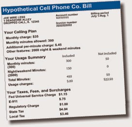
TELECOMMUNICATION INDUSTRY
 |
| Picture credit: http://citizensutilityboard.org/CellphoneShoppersGuide.htm |
Recommendation: Visualize the story
 |
| Picture Credit: http://www.helenzhou.me/bill/ |
The adjacent phone bill beautifully visualizes the phone bill and gives insights about
services exhausted and also about pending services. It gives you a good overview about the distribution of calls, data and messages throughout the billing month. Moreover it also provides insights about the daily average calls, data and messages.
FINANCIAL SERVICES INDUSTRY
Ever happened to work with stock spreadsheets with gazillions of data consisting of plain numbers?
It is not only time consuming to get some value out of this type of data but there are good chances of making errors while trying to get some valuable insights from such a sheet.
 |
| Picture Credit: Investexcel.net |
Recommendation: Summarize the data using data visualization
 |
| Picture Credit: KendoUI |
E-COMMERCE INDUSTRY
 |
| Picture Credit: Visible Technologies |
Recommendation: Categorize data
 |
| Picture Credit: Visible Technologies |
In the preceding graph, the x and y labels are clearly marked with data about the day of Thanksgiving, cyber monday etc. rather on marking directly on the graph as done in the previous picture. Moreover the data is categorized clearly indicating the buildup time, the peak time, the lull and the 2nd wind.
References
http://data-informed.com/data-visualizations
References
http://data-informed.com/data-visualizations
No comments:
Post a Comment